Adjust colors in the Contour Plot 2D
참고
To change the color info with the slider, select the relevant signal title first.
There are different ways to adjust the colors in the contour plot:
Change the color map
Data Analysis allows you to choose different sets of colors for the contour plot.
-
Click the Properties icon
 in the toolbar.
 -
Select the Contour Plot 2D page.
-
Under Color Map, select the required map.
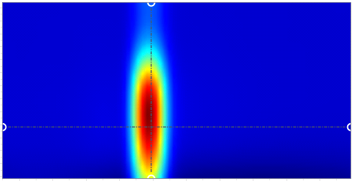
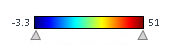
그림: Jet (default) 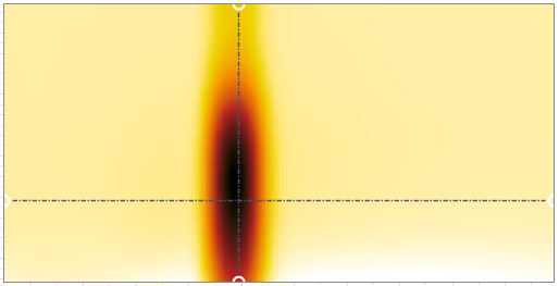
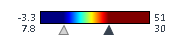
그림: Reverse blackbody This color map uses white and yellow to visualize low values and goes to red and black for higher values. It can be a viable option for color blind people.
Change the color gradient
Data Analysis allows you to change the color gradient to show regions with a limited value range more clearly.
-
Choose if you want to apply the color gradient to all signals in the contour plot, or only to a selected signal.
To apply color gradient to all signals, click All signals same scale (global).
To apply color gradient only to one signal, click All signals same scale (per pane), and select the relevant signal.
To select a signal, click on the signal title of the relevant panel in the contour plot.
The color slider shows the minimum and maximum values of the selected signal or signals.
-
Drag the triangles to a new position.
The new minimum and maximum values are shown in addition.
-
To focus on higher values and hide differences of lower values, adjust the minimum value. To focus on lower values and hide differences of higher values, adjust the maximum value.
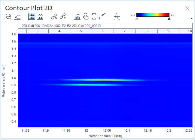
그림: Example: Contour plot with default color gradient 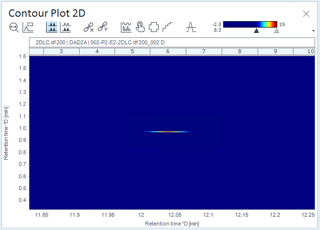
그림: Example: Contour plot with adjusted lower value of the color gradient 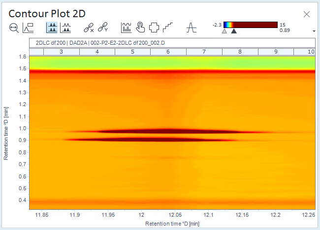
그림: Example: Contour plot with adjusted higher value of the color gradient
base-id: 10237153547
id: 10237153547