| Select the format in which the curves for the different compounds are compared.
In the Separate format, multiple curves are shown in separate graphs under each other or next to each other (depending on the # Graphics setting in the Layout page): # Graphics set to 1: 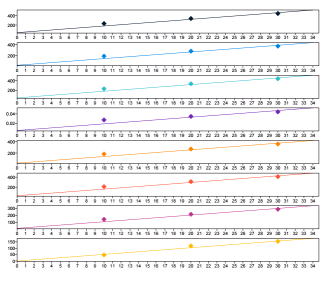
# Graphics set to 4: 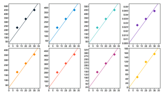
In the Overlaid format, multiple curves are shown in an overlaid graph: 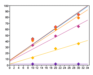
In the Stacked format, you can additionally set the offset for the response axis and amount axis. The axis values refer to the first graph in the lower left corner. This offset is added as a space between the different graphs.
|
Group Multiple Calibration Curves |
| With these grouping options, you can arrange the different calibration curves according to their origin. The resulting graph or graphs depend on the selected Display format:
In the Separate format, the graphs for all calibration curves are shown separately, but the graphs belonging to different groups are distinguished by different background colors. These group colors are set by the system; you cannot change them. In the Overlaid format, one graph is shown for each group of curves; the curves in each graph are overlaid. In the Stacked format, one graph is shown for each group of curves; the curves in each graph are stacked.
The grouping options have the following effects (inside the group, the curves are always sorted by their curve legends):
by Compound: Calibration curves for compounds with the same compound name are grouped together. by Sample: Calibration curves based on samples with the same sample name are grouped together. by Injection: Calibration curves based on the same injection are grouped together.
|