Calibration curves
With calibration curves, you can place the visual presentation of the calibration results on your report template. The graph shows the results for all compounds and calibration samples that are included in the selected data.
NOTE
In order to obtain a calibration curve, you must have configured the respective samples as calibration samples in the sequence table, and you must have configured the calibration table.
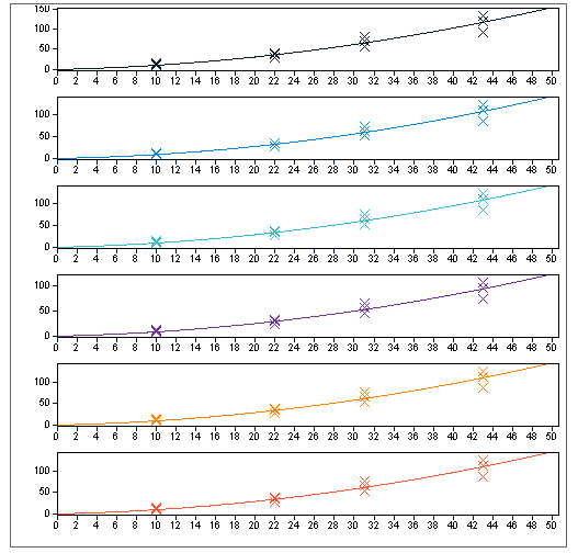
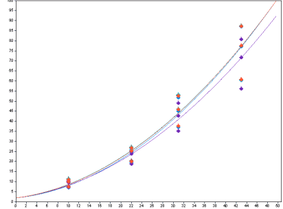
Depending on the configuration of the report item, the multiple curves may be shown in separate, overlaid, or stacked graphs.
Types of calibration curves
In the Report Items browser, the following snippets are available for the calibration curve:
Calib Curve Plot by Compound contains a composite group with a calibration curve and additional information such as the formula or the correlation coefficient. The composite group is automatically repeated on the compound name. Therefore, if your data contains multiple calibrated compounds, the information is repeated several times.
Calibration Curves Overlaid adds a single calibration curve item. In this item all curves contained in the current scope (defined by data selection, grouping, filtering, etc.) are shown overlaid in the same graph. You can configure the display format and group settings.
Subpages
base-id: 11030873611
id: 27021608795096587