Category Group
For all chart types, the category group has an impact on the amount of displayed data. You can choose a category group expression that groups multiple subsets of data together. For example, if your data contains multiple injections of the same sample, you can choose the sample name for the grouping expression. The chart will then show only one data value for each distinct sample, such as the average compound amount.
The impact of the category group on the x-axis labels depends on the chart type:
For line and column charts, the category values are identical to the x-axis values.
For scatter and bubble charts, the category group only has an impact on the amount of displayed data — the x-axis values are set separately and can differ from the category values.
Category Group Example
For example, your data may include 3 samples, where each of the samples has been injected 2 times. If you select =Injection_ID as a grouping expression, the diagram will contain 6 data points. If you select =Sample_ID, the diagram will only contain 3 data points. Each data point may show, for example, the average of the 2 peak areas.
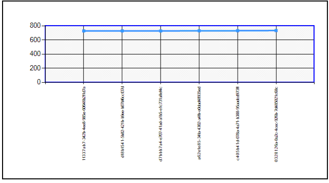
Line chart with the following settings:
y-value: =Peak_Area
Category group expression: =Injection_ID
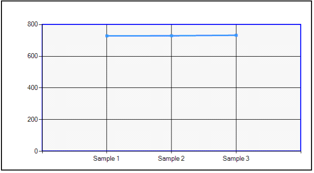
Line chart with the following settings:
y-value: =Avg(Peak_Area)
Category group expression: =Sample_ID
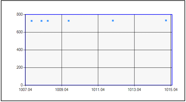
Scatter chart with the following settings:
y-value: =Peak_Area
x-value: =Compound_Amount
Category group expression: =Injection_ID
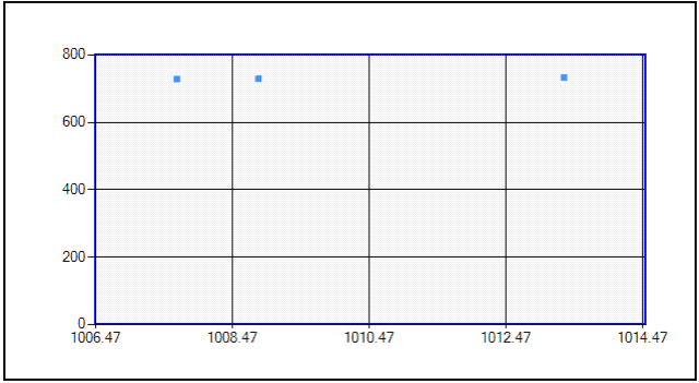
Scatter chart with the following settings:
y-value: =Avg(Peak_Area)
x-value: =Avg(Compound_Amount)
Category group expression: =Sample_ID
base-id: 11031297291
id: 11031297291