Charts
Charts are very useful for graphic display of data. As in tables or matrices, you can present aggregated data.
The following chart types are available in RTE:
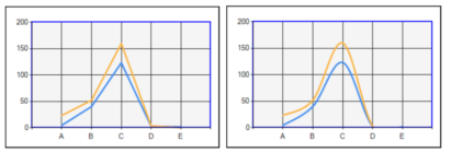
Line chart
With line charts you can visualize categorized data using a direct line to connect the values. The category values are used to label the x-axis. For example, you can categorize the data by the sample name, calibration level or compound name. Different series of data are shown as several lines in different colors.
Line - Simple and Line - Smooth:
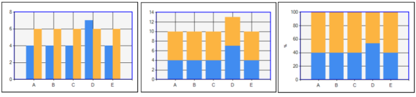
Column chart
Column charts are very similar to line charts. You can also visualize categorized data, but the data is shown as column bars instead of being connect with a line. The category values are used to label the x-axis. For example, you can categorize the data by the sample name, calibration level or compound name. Different series of data are shown as several bars in different colors.
Column - Simple, Column - Stacked, and Column - Stacked 100%:
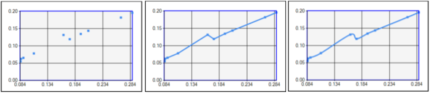
Scatter chart
In scatter charts, the location of the data points is determined by x and y-values. The x-values are typically numeric values or date/time values. For example, you can show the ratio of compound amount to peak area in an accuracy plot.
Scatter - Simple, Scatter - Lines, and Scatter - Smooth Lines:
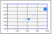
Bubble chart
As in scatter charts, the location of the data points is determined by x and y-values. In addition, the size of the bubbles is determined by the variance in the value of a specific data field. The bubble size therefore adds a third dimension to the graph.
Typically, you select a value such as Peak_Area to determine the bubble size. The bubble size will then vary for each printed peak (that is, for each bubble). The highest value - in this example, the largest peak area - will be drawn as the biggest bubble. The smallest value - in this example, the smallest peak area - will be drawn as the smallest bubble.
Bubble:
Subpages
base-id: 11031286539
id: 36028808050250507